Home
The operator home screen: today's numbers, recent activity, and what needs attention next
The Home page is the operator's landing screen after signing in. It pulls the most frequently checked data points together in one view: sales performance, customer activity, recent orders, and the enquiries pipeline.
Home is designed for a morning-check-in workflow: open the dashboard, see how the business is performing, spot anything that needs action, then drill into the relevant tool (Orders, Customers, Enquiries) from there.
The Home page layout
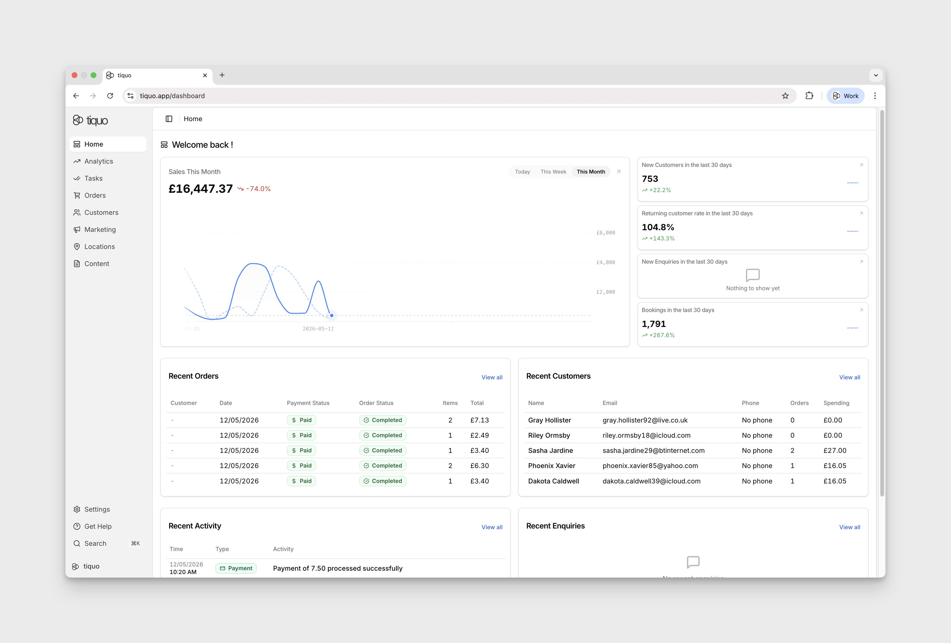
1. Sales chart
A large chart showing sales over time for a selected period. A toggle at the top-right selects the view:
- Today: hour-by-hour sales for the current day
- This Week: daily sales for the current week
- This Month: daily sales for the current month (default)
2. Stat cards
A column stacked to the right of the sales chart, summarising the following metrics over the last 30 days:
- New Customers
- Returning customer rate
- New Enquiries
- Bookings
Each card shows the current value and the percentage change versus the prior 30-day window. An arrow icon in the corner of each card links through to the full report for that metric.
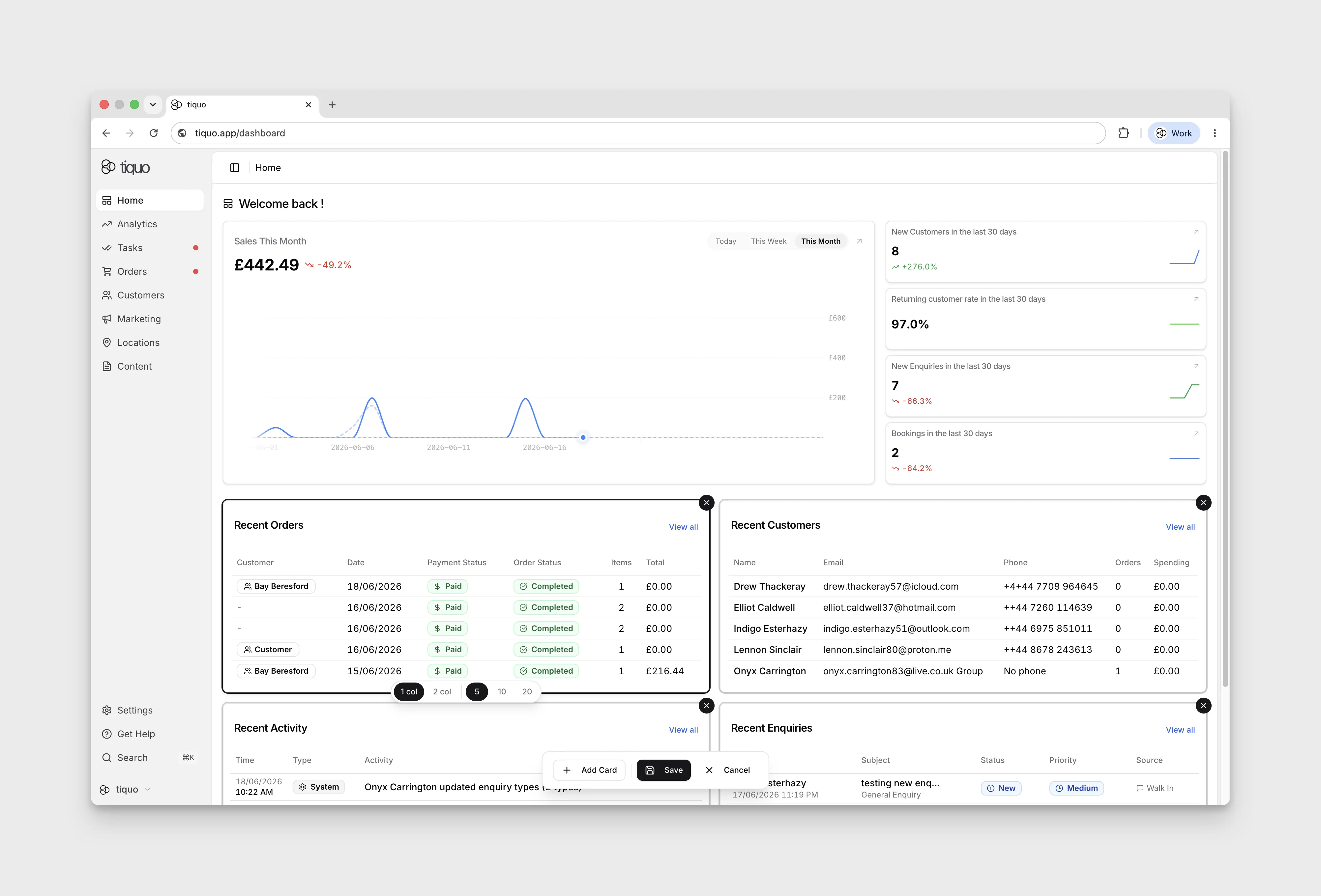
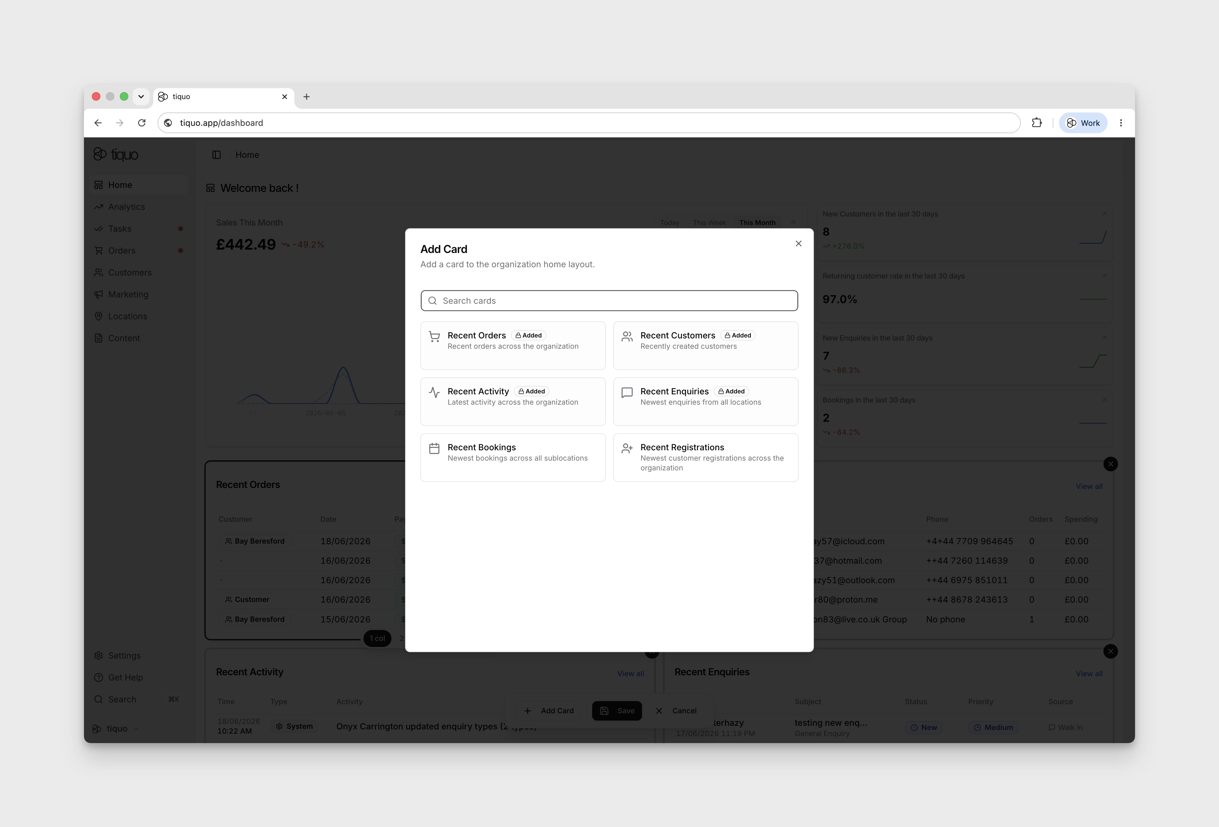
3. Compact Summaries
Every block here is a summary plus a link, providing a fast way to jump from the overview into the relevant tool:
- Recent Orders
- Recent Customers
- Recent Activity
- Recent Enquiries
Editing the Home Layout
The Home page is customisable. Press the Edit button at the top right to enter edit mode, where you can add, remove, and rearrange cards. Selecting a card also lets you change its width between a single-column and two-column layout.
Some summary cards also let you choose how many records to show, so different teams can tune the Home view around the information they check most often.