

Analytics Overview
Real-time performance insights across your locations, sublocations, and services
Tiquo's analytics give you a real-time view of how your business is performing across locations, sublocations, and services. Data is collected automatically from bookings, orders, payments, and customer activity, so you can understand performance without manual reporting.
Navigating to analytics
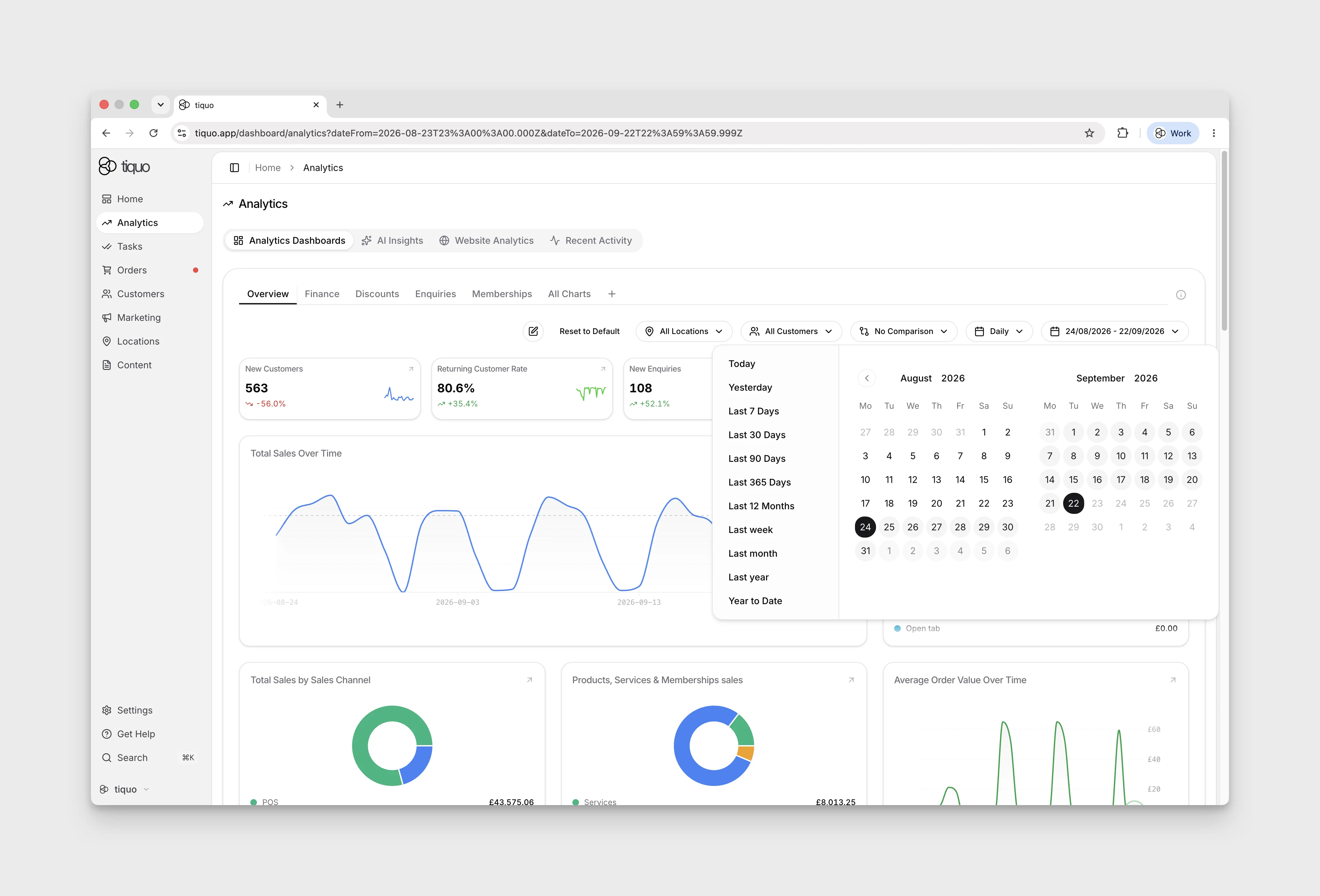
Open Analytics in the main sidebar and select Analytics Dashboards to see a customisable grid of stat and chart cards. Use the controls above the grid to edit it, filter by location or date, and compare periods. Available granularity depends on the date range: for the inspected Last 30 Days range, Daily and Weekly are available and Monthly is disabled. Open the granularity menu to check the options for your range. Click a card to open a larger drill-down view.
| Chart | Use it for |
|---|---|
| Line and area | Trends over time |
| Donut | Breakdowns |
| Map and globe | Metrics by location: Sales by Location, Bookings Happening by Location |
| Funnel and Sankey | Pipelines and status-based metrics: Conversion Funnel, Order/Booking/Enquiry flow |
| Hourly views | Time-of-day patterns: Avg Bookings Made by Hour, Avg Booking Time by Hour, Avg In-Person Activity by Hour |
Use Edit to reorder, hide, or replace cards. After reordering, select Save to keep the new layout, or Cancel to discard the unsaved reorder.
What the analytics dashboard shows
The Analytics dashboard shows performance metrics across your organisation.
This includes:
- Sales and revenue performance
- Customer activity and behaviour
- Booking and enquiry trends
- Conversion and marketing performance
- Staff and point-of-sale activity
View metrics for the whole organisation, a location, or a sublocation.
Each stat card on the dashboard expands into a larger drill-down window with Tiquo AI when clicked, giving deeper context without leaving the page. See Expanded card breakdowns.
Booking date bases
Check the date basis before comparing booking charts:
- Bookings created filters and groups records by the date the booking record was created, regardless of its scheduled start. It includes current scheduled, no-show, rescheduled, waiting-list, active, and completed records, while current cancelled and draft records are excluded.
- Location, scheduled booking, and booking-outcome measures use the booking's scheduled start date.
A booking created today for next month therefore appears today in Bookings created and next month in a scheduled-date measure.
Mobile analytics tiles
In Tiquo App, each staff user can choose up to eight analytics tiles and drag them into the order used on Home and in the analytics carousel. The preference is saved for that user and follows them across devices.
Expanded card breakdowns
Select a card to open it in a larger view. Expanded cards on the Analytics dashboards, on Home, and in the summary bars at the top of pages such as Orders, Bookings, Customers, Enquiries, and Tasks show a Breakdown below the chart. Each part of a breakdown is counted from the same records as the card's headline figure, so the parts add up to it. A split whose parts wouldn't add up exactly is left out rather than shown with a gap.
Most expanded cards include:
- By weekday: the average for each day of the week
- Week by week: each week against the same days of the previous period
- By segment or By series: each part's value and share, for cards with more than one part
Averages such as average order value, check-in rate, and returning customer rate are weighted by each day's volume, so days with no orders or bookings don't pull them down.
Cards about sales, customers, enquiries, and bookings add their own splits:
| Cards showing | Extra breakdowns |
|---|---|
| Gross sales | Gross to net (gross sales, orders, average order, refunds, and net sales), By sublocation, By sales channel (Online, POS, and Staff), By category, By hour of day, and By payment method |
| New customers | By registration source, First purchase, Back within 14 days, and how many opted in to marketing or made a purchase |
| Returning customers | New vs returning customer-days, Visit frequency, and Revenue by customer |
| Enquiries | Responses (responded, awaiting reply, won, lost, and first response time) and By source |
| Bookings | By status, By channel, and Lead time |
By payment method groups each order's value by how it was paid: Card, Cash, Bank transfer, Room charge, Manual or external, Free, Other, or Not recorded. Loyalty points spent on an order count as their own method, so an order paid partly with points is split between Loyalty points and the method used for the rest.
Filtering analytics
Analytics can be filtered by date range, location, and sublocation to focus on specific time periods or parts of your business.
- Date filters allow you to view performance over custom ranges or predefined periods. Open the date control and choose a preset such as Last 7 Days; the date range updates immediately.
- Location filters let you isolate individual venues or compare performance across multiple locations. Open All Locations, make your selection, then select Apply. Staff without the Access all locations permission only see analytics for the locations they have been given, and All Locations means all of their locations rather than the whole organisation.
- Customer list filters let you scope customer-backed charts to selected marketing lists. Open All Customers, choose a list or segment, then select Apply. The selected audience name appears above the dashboard.
- Comparison views offer Compare to Previous Period and Compare to Previous Year from the No Comparison menu.
- Segments let you filter analytics by customer segments. Segments are customer groups defined by any combination of filters set up in the Marketing section. Filtering analytics by a segment lets you see how a specific audience, for example VIP members, first-time visitors, or lapsed customers, is performing against your metrics. See Lists & Segments for the full setup.
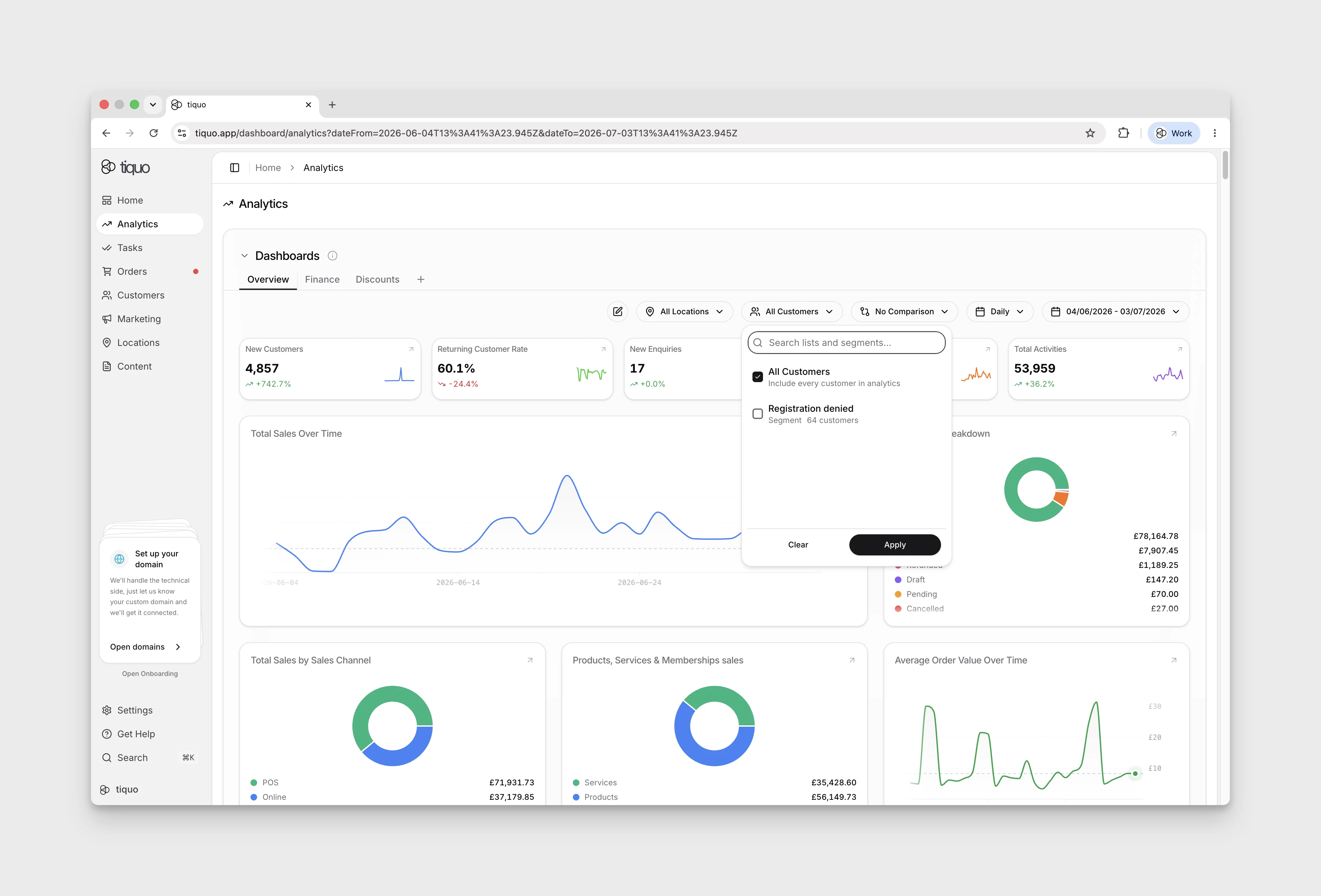
Apply location or customer-audience selections with Apply. The dashboard then loads the selected view without requiring an export.
Select the dashboard you want to customise, then choose Edit → Add Chart. Use Search charts... and select a result to add it. Close the chart picker, then select Save on the dashboard to keep the change. Some results contain several metrics: Activity Overview, for example, includes Total Activities, Staff Activities, and Customer Activities.
Capacity analytics
Capacity cards report finite bookable inventory across the selected period. Add them from Edit under the Capacity category. Available cards show:
- total, booked, remaining, and utilization
- fully booked, partially booked, empty, and overbooked windows
- booked compared with remaining capacity
- utilization over time
- utilization by sublocation, service, service category, service type, inventory, and inventory type
Capacity is based on finite slots and stay-night windows. Cancelled, no-show, draft, and waiting-list bookings do not consume it. Unlimited slots and ordinary appointment calendars are excluded because they do not have a comparable finite capacity window. Shared inventory is counted once and attributed to the highest-priority required service connection.
Membership analytics
Membership cards cover active members, recurring revenue, new and cancelled members, retention, churn, average tenure, and renewals due in the next 30 days. Further cards break down plan distribution, billing periods, plans held together, plan revenue, cancellations, and membership changes.
For plans with a minimum term, add the minimum-term cards to compare:
- people who reached the end of their minimum term
- people who continued beyond it and people who cancelled
- continuation and churn by plan
- churn for higher outside spend compared with no or lower outside spend
- churn and average outside order frequency by spend band
These cohorts use people whose minimum term ended inside the selected period. They are separate from the general active-member and cancellation totals.
Enquiry analytics
Enquiry charts treat Won and Lost as closed outcomes. Closed enquiries over time counts enquiries whose current status is won, lost, closed, resolved, or archived. Total Open Enquiries, and the open figures in Enquiry Status and Enquiry Distribution, leave those statuses out. In Enquiry Distribution, an enquiry can count as open, in progress, responded, and urgent at the same time, so the segments can overlap.
Website analytics
Website Analytics shows traffic and engagement from sites connected to Tiquo.
It includes first-party pageviews, sessions, traffic sources, devices, known-customer activity, and custom events sent through the DOM Package or Tiquo-managed content sites.
For the full website analytics workflow, see Website Analytics.
Funnel and AI analysis
Funnel charts show where customers continue or drop off during a journey.
Open a funnel card to see conversion and drop-off statistics for each step, with Tiquo AI analysis where enabled. Review where customers leave before changing the flow or campaign.
AI insights beta
AI Insights is a dedicated Analytics tab for staff with permission to view Analytics. It provides a conversational, read-only way to explore the organisation's analytics and can prepare focused briefings around the staff member's role and interests.
The first visit asks a few setup questions so the briefings and suggested questions can be made more relevant. Staff can reset those personal preferences later. Answers remain limited to the locations and data the signed-in staff member is allowed to view.
Organisation administrators can enable or disable the feature under Settings > Tiquo AI. When disabled, the AI Insights tab is hidden for the whole organisation.
AI-generated analysis can be incomplete or incorrect. Check important conclusions against the underlying charts and operational records before acting on them.
Hotel analytics
Check Edit → Add Chart for the hotel metrics available to your organisation. In the demo, searches for occupancy and room returned no matching charts, so a dedicated hotel-metrics setup cannot currently be followed there.
Recent activity summary
Select the Recent Activity tab in Analytics to open the full activity feed. Home also has a Recent Activity summary with a View all button.
View all opens the Recent Activity page, where activity cards (Total Activities, Staff Activities, Customer Activities, Physical Activities, and Order Activities) sit above the feed. The timeframe card at the start of the row sets the period for these cards. It starts at the last 7 days, and its arrows step back or forward by the same length of time, never past today. The feed's own date filter is separate. The cards need the View analytics & reports permission.
Payment activity
In Recent Activity, select the Payments category to filter the activity feed to payment events. The demo can show No activities found when that category has no entries.
For connected payment accounts, open Settings → Payments. See Payments for the demo preview and its limitations.
Floor-plan area charts
Where enabled and populated, Add chart offers sales, orders, average order value, visit duration, product and category popularity, bookings, and occupied table hours by floor-plan level or area. Date, sublocation, and customer-list filters apply.
Paid order attribution keeps the area recorded at settlement even if a table moves later. A bill spanning several areas uses a multi-area bucket, and records without a mapped area use Unassigned area. The same sale is not counted once per table.
Occupied table hours measures observed occupied time multiplied by table count. It is not a percentage of available capacity. Historical backfill can only estimate from surviving assignments and timing; past moves without recorded visit segments cannot be reconstructed. Records awaiting backfill are labelled accordingly.
Customer lifetime value and currencies
Customer value can include imported legacy order history. When lifetime amounts use currencies that cannot safely be combined, Tiquo withholds a single combined lifetime-value figure. Use the available currency-specific information rather than treating a missing combined value as zero.